
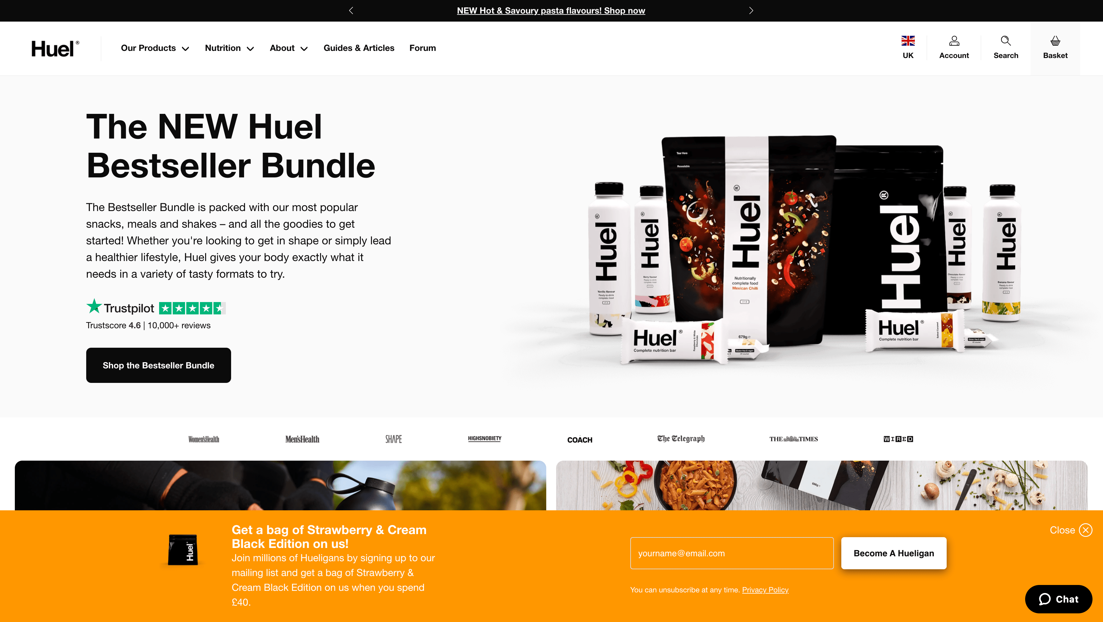
Huel is a UK online health food brand that offers meal replacements in the form of powders and ready-made shakes. The business was founded back in 2014 but has seen explosive online growth over the last two years. As their online revenue is expected to pass $100M in 2022, there are clearly some lessons to be learned studying Huels approach to online marketing.
In this first in a series of case studies, I take a closer look at how Huel uses its newsletter and subsequent emails to drive new customers growth.
Each of these case studies will look at the 3 key elements of any successful email marketing campaign. Signup, Email copy and design, and Landing page optimisation.
SIGNUP – The Newsletter Sign Up
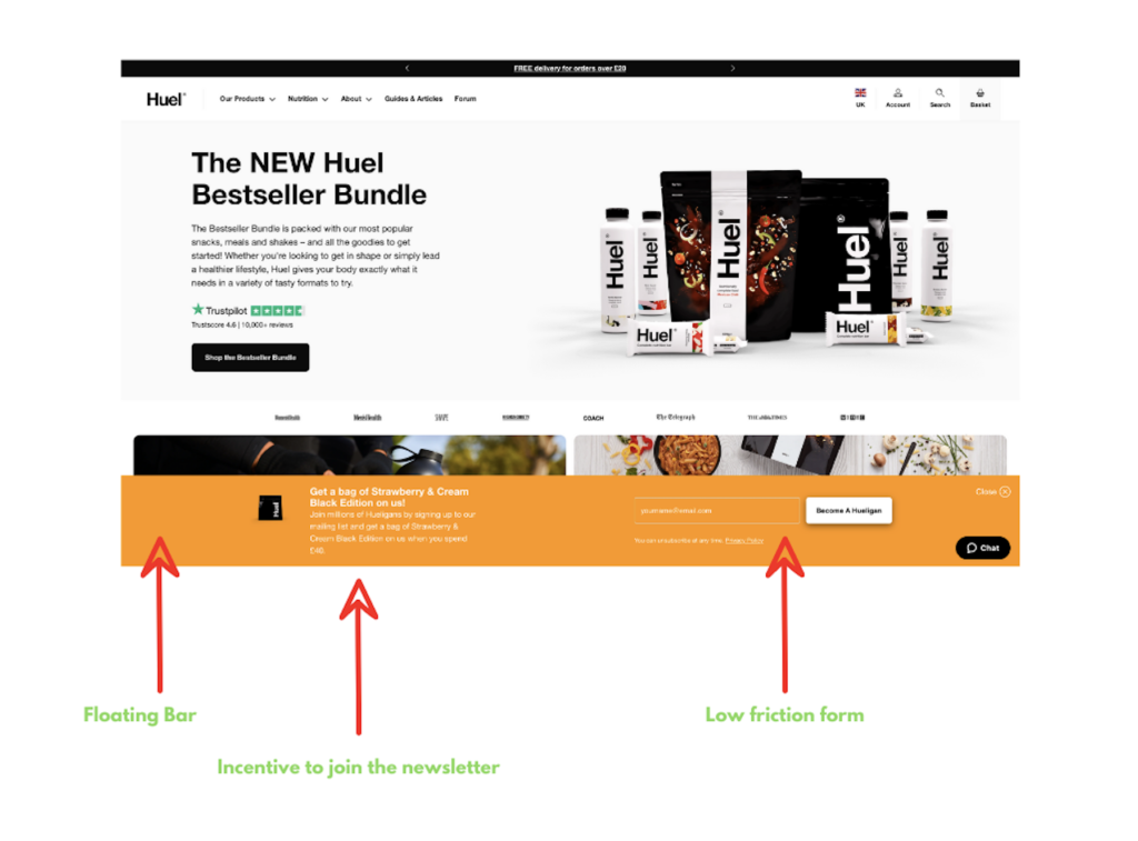
The huel website is a case study all of its own, so let’s just limit our focus here to the way they utilise a combination of strong colours, a good incentive and low friction form to drive sign-ups.
Floating bar
Huel combines a bold colour that catches the eye with a bit of tech known as a “floating bar” that allows them to keep the sign-up form in the eye line of the visitor without annoying them with pop-ups. This is very smart as the use of pop-ups although effective when used correctly run the risk of annoying visitors or simply being closed. Pop-ups should always be combined with some form of visitor engagement. Such as the number of pages viewed or the specific time on site the visitor has remained.
Incentive
Using a very clear incentive to join the huel newsletter has two advantages. Firstly it helps overcome consumer reluctance to give their email address away for nothing. Consumers know you want their email address for a reason, and they increasingly recognise this value.
Low Friction
Huel has taken the decision to forgo additional information on sign up in favour of making the process as frictionless as possible. They don’t even take the first name of the subscriber, which is quite unusual. This makes future personalisation of messages harder, which is worth taking into account when designing sign up forms for your own business. Huel has clearly opted for speed over personalisation at this stage. Something they can remedy on first purchase.
EMAIL – The Welcome Email
As the email design is quite long, I’ve broken it into 3 sections for easier viewing. I have included a screenshot of the entire newsletter at the bottom of this post for those interested in seeing the complete design.
The email itself was sent from “team @ huel.com” which given the size and type of business we’re looking at makes sense. I’ve written a lot in the past about my preference for using peoples names in emails, especially those soliciting a response. Here the absence of a name is completely fine.
Subject Line & Preview Text

As noted above, Huel took the decision to minimise their sign up form. This means at this stage in the email sequence they don’t know my name and therefore can’t use it in the subject line or intro paragraph. They instead adopt a clever tactic of implying familiarity and exclusivity in 4 words. The preview text reinforces the incentive used in the initial signup form.
The subject line is excellent given the stage in the customer journey and the length of the preview text is perfectly utilised to reinforce the incentive. It honestly doesn’t get much better than this.
Incentive
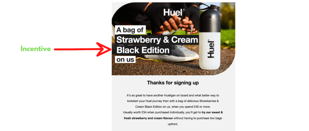
Huel maintains continuity from their sign up form and preview text, by leading with the free food incentive we saw earlier. Continuity is extremely important when guiding a new subscriber through the nurture sequence. It would have been nice to personalise the intro paragraph with the subscriber’s name, but as already mentioned I can only assume they measured conversions from several sign-up forms and concluded it was worth the sacrifice.
Call to Action
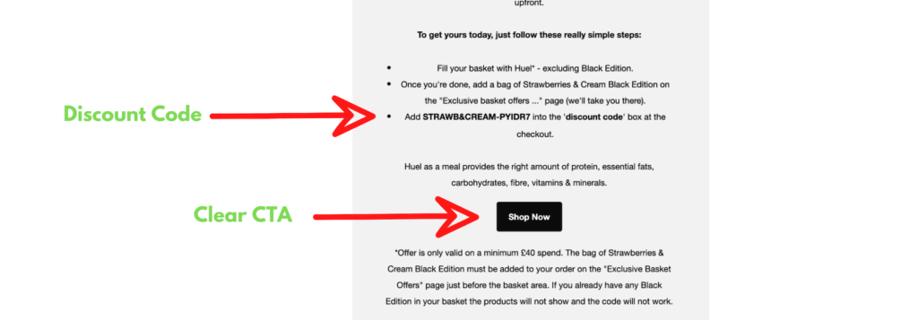
This email is a textbook goal-orientated messaging. Huel wants you to use the coupon right away. The reader’s attention is directed to the shop now button (call to action) and the coupon code sits right above it begging to be used.
Interestingly they opted to exclude any sense of urgency from this part of the email. I would have perhaps included an expiry date for the code, which could have improved results even further. (its possible they of course have split tested that method and I’m only receiving this version)
Segmentation
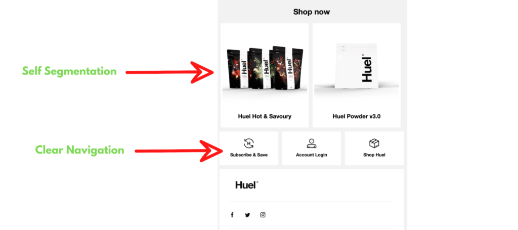
At this stage in the subscriber’s relationship with Huel, very little is known about their interests. Other than a willingness to accept coupon codes in exchange for an email address. The two images below the shop now button are potentially being used to apply interest tags to the subscriber’s profile within Huels email marketing software. If this isn’t the case then it’s a missed opportunity on their part.
Presenting the reader with two clearly distinct choices with a clickable link means that any interaction with that link can be passed to the email software and stored against the subscriber. Over time these seemingly random engagements with emails allow a more sophisticated business to tailor messaging to the interests of the subscriber. Basically the more you know about your subscribers the better the content you can share with them and the deeper the relationship will develop.
Goal
Here you can see the full email as designed. It’s crystal clear this email has a single goal (with a smaller secondary one of self segmentation). Huel wants the subscriber to use the coupon code and try the product. It’s also worth noting the code is only valid when used with another purchase of £40 or more. So they’re not just throwing free food at every new subscriber.
Huels subscription business model is very suited to this marketing tactic. The deal being offered here is the equivalent of 17 meals. A fraction of the normal number of meals consumed on their monthly subscription.
As a fall back they are presenting a second option to the reader, which is to find out more about two products (displayed below the shop now button). These two products are unlikely to be chosen at random. The two items are more likely to appeal to different segments of their customer base. In offering these two choices Huel is able to track the engagement on those links and tag the subscriber with that information.
This form of self segmentation is very useful as information can be gathered over time to build a complete picture of the subscriber’s tastes. This of course allows future emails to be tailored to match those interests and dramatically increase engagement!

One final note on the overall design and layout of the email itself. Huel has decided to keep their email light on images. This is interesting given the brands strong catalogue of superb photography. The focus is almost entirely directed towards using the coupon code. This conveys (intentional or otherwise) the impression that the company is confident its product will speak for itself.
LANDING PAGE – Conversions
The last part of the sequence is the landing page. This is the webpage Huel is directing the clicks from its email to.
I’ve included a screenshot of the top portion of the page, but the entire page included more than 25 products and was too long to show in its entirety here.

This is by far the weakest stage of their sales funnel. They do manage to maintain some continuity by at least displaying the image of the product they used in the initial sign up incentive. Unfortunately, the page also displays another 25+ products as well (not included in this screenshot). They basically throw the entire product line at new visitors. As a first time visitor, you’re like to feel overwhelmed by choices and easily abandon the visit for lack of time. This kind of drop off is a killer for page conversions because getting that visitor back will most likely require more emails and of course time.
A better approach would have been to have a dedicated landing page created that has pre-filled bundles and coupon codes prefilled, allowing the visitor to add to the basket in a single click. Bundles could be split tested to find the optimum mix and then used as the primary suggestion. This approach would see conversion rates dramatically increase as a result of less visitor confusion.
Rating – 8/10 Excellent!
The only element (but it’s a big element) that stops huel from getting a perfect 10 out of 10 is the landing page. It’s completely out of place with the other elements of their email marketing. To just refer visitors to a page with all your products on is lazy marketing from what ordinarily I consider a top tier marketing team. It really makes no sense at all.