
 Analysts use heatmaps to analyze the magnitude of an event by visual cues. A data visualization technique, heatmaps are utilized to derive quick interpretations of the intensity of the event and do course-corrections accordingly.
One of the examples of a heatmap can be the visual representation of COVID-19 cases being registered globally. The following map shows the geographic distribution of the cumulative number of COVID-19 cases reported per 100,000 people worldwide. Darker shades of orange denote most affected countries, and the light yellow hues indicate the opposite.
There are quite a few efficient ways to generate a heatmap, such as using readily available free heatmap generators or integrated analytical tools. Microsoft Excel is another great option to explore.
Creating a Heatmap in Excel
When using Excel, you can either create a heatmap by manually coloring each cell depending on its value or enter a smart formula/function to do all the taxing work for you. We’d suggest you use the latter method to create a heatmap.
Let’s consider the dataset extracted from the above represented COVID-19 globally registered cases as an example to learn how to create a heatmap using an Excel function – apply Conditional Formatting.
Step 1: Enter Data Enter the necessary data in an Excel sheet. We entered the data.
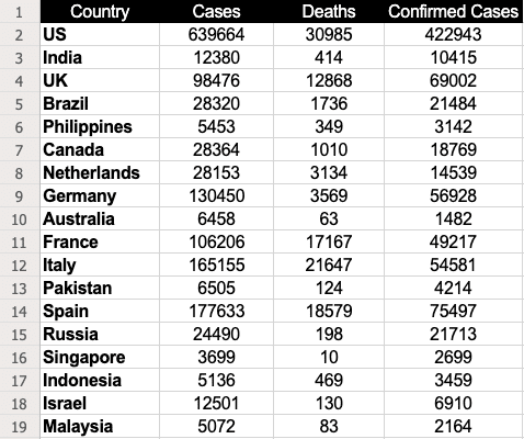
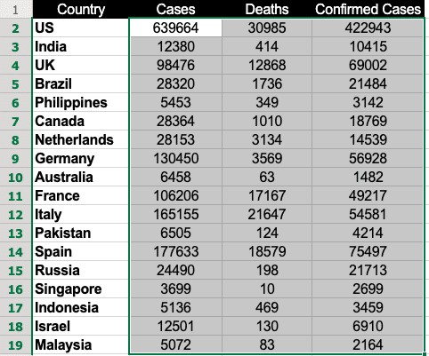
Step 2: Select the Data Select the dataset for which you want to generate a heatmap. In this case, it would be B2 through D19.
Step 3: Use Conditional Formatting Go to Home, click on Conditional Formatting and select Color Scales. The color scale offers quite a few options for you to choose from to highlight the data. – Read more