With every other blog post talking about eCommerce conversion strategies that can help you boost sales, it can get a tad overwhelming and exhausting to narrow down on ones you must pay attention to. To that end, we have done the heavy lifting for you and shortlisted those we know are sure to make a difference in helping you grab shoppers’ attention and persuade them to purchase from your online store.
In this guide to eCommerce conversions, we will look at 15 actionable tactics you can implement to stand out among the competition and get shoppers to fall in love with your online store.
1. Reverse engineer the customer journey
The customer journey tracks the steps a potential buyer goes through from getting interested in your niche, becoming aware of your brand, finding out more about your product to making a purchase. Most online depictions of the customer journey make the process appear simple. It is usually represented linearly and consists of 5 stages – from awareness to retention.
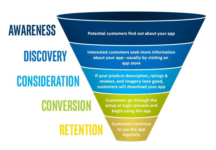
The reality of the customer journey is a lot messier. People skip steps, rush to purchase, or never come back to your website. Yet while the customer journey is messy, there are analytical tools that help you understand where visitors enter your eCommerce store, where they drop-off, and the common paths they take to finally make a purchase.
One of the most used tools for analyzing the on-site customer journey on your website is Google Analytics. You can create custom dashboards in Google Analytics that help you visualize how people move around your eCommerce site, the landing pages through which they discovered your product pages, and where there is a significant drop-off.
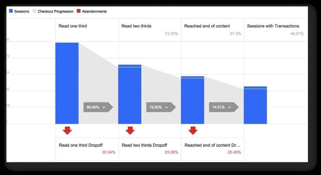
A comprehensive analysis of how visitors move around your eCommerce store and in and out of each stage of the customer journey can help you identify their pain points so you can rightfully tackle them through A/B testing.
2. Optimize your site speed
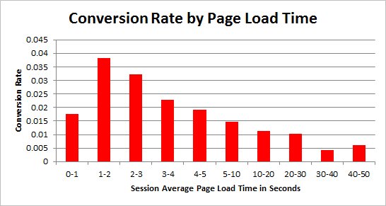
One of the simplest methods to increase conversions is improving the page load time. The reason for this is pretty straightforward; if a page takes a long time to load, your store visitors get impatient and leave the website.
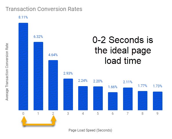
The graphic below precisely illustrates the correlation between page load time and conversion rates.
While this chart comes from a study on general conversion rates, there is also a large body of data about how page speed impacts eCommerce conversion rates specifically. Amazon’s study on how even milliseconds of latency affects revenue is probably the most cited example. Every 100 ms of latency costs the company 1% in sales, they claimed[1].
Portent conducted a study on page speed that revealed some interesting insights for eCommerce store owners. They found that the highest eCommerce conversion rates occur at a page load speed of 0-2 seconds[2].
When it comes to page load time, some pages are naturally more important than others. The most important ones include the homepage, checkout, product, category, and login pages. Any page where you receive a lot of traffic, you should prioritize optimizing.
3. Simplify navigation on your store
All the best eCommerce stores are flat and extremely easy to navigate. ‘Flat’ means having as few layers as possible to your site design – everything on your site should be accessible within three clicks of the homepage. More importantly, you also want to make it as simple as possible for site visitors to get from the core landing pages to the product pages and checkout page so that making a purchase is as seamless as possible.
Just like longer page load times cause shoppers to walk away from your store, a labyrinthine site design also tends to frustrate them, leading to drop-offs. There are numerous ways to optimize your menu to improve eCommerce site navigation. You could start by including breadcrumbs, simplifying the options on the menu, prioritizing elements, and so on. The ideal solution will be specific to your eCommerce store.
Let’s understand the same with the example of Slideshop. After thoroughly analyzing their data, the teams discovered that shoppers weren’t clicking on the subcategory. To improve usability, they ran an A/B test on the side menu to create a better flow from categories to subcategories. They got rid of the promotional right sidebar and introduced a left navigation bar. Here’s a look at the control and variation from the test:
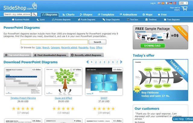
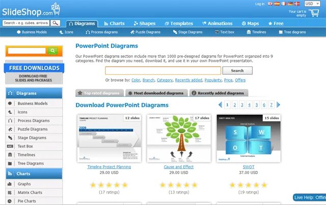
The variant with the navigation menu on the left increased the add to cart clicks by 34%. The case study stands testament to the fact that smooth navigation is closely linked to increased sales for any eCommerce store. – Read more


